The Power of Signage
To the average person, signage has become a natural part of our urban environment. The signs are still doing their job, but the power of signage has become a part of the subconscious, its many benefits are not directly thought about by the average person and customer that you might have walking into your store. The key is not getting lost in the noise, and instead, stand out. Once you stand out, the key is becoming a staple. Using the right type of signage can go a long way in helping you stand out.
Let’s examine a master of signage: McDonald's
McDonalds: Masters of Signage
McDonald's has been around for eighty years and has grown and endured during its eight decades of existence. When you see those Golden Arches, you automatically know what they mean: food, affordability, comfort, and familiarity. Introduced in 1968, the Golden Arches were a masterstroke, but the logo wouldn’t have had much standing if it weren’t for the incorporation of signage.
In deploying and spreading their logo, McDonald's employed different forms of signage along with a combination of a few. Let’s take a look at a couple of signs and the power they have at extending the McDonald’s brand.

Pylon Signs Used as a Beacon
We will start with the most important type of sign in their arsenal, and one that any business should think to employ. Pylon signs are freestanding signs that literally elevate your logo. You have certainly seen the Golden Arches peeking or towering over highways as you are driving. This is the primary function of a pylon sign: to elevate your message.
McDonald uses a pylon sign as a beacon. Like putting their logo on a loudspeaker, it makes it clear to everyone passing in a large radius that right underneath that sign is a McDonald's Restaurant and all that it stands for. The pylon is the perfect way to capture the attention of anybody speeding along the highway.
Their signs, whether as a topper for a pylon sign or on their buildings, are never flat.
Channel Letters to Make Any Logo Pop
McDonald's does not utilize flat signage for its name and logo. Instead, they use eye-popping channel letters or metal lettering. Channel letters are three-dimensional,  incorporating dimension and making signage stand out. Practically all of McDonald’s signage uses channel letters.
Flat traditional lettering can blend in with the building and become invisible, but by using dimensionality McDonald’s can catch their customer's eyes and relay any information they might need. A combination of flat signage and channel lettering allows you to lead eyes to where they need to be while giving official information in the process.
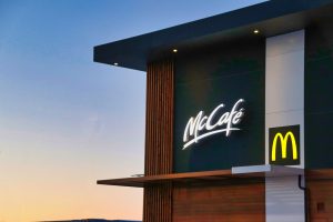
Take for example the McCafé logo in this picture. The logo is next to the flatter, McDonald’s logo on the bottom right. The channel lettering of the McCafé name is meant to capture your eyes first, so you know right off the bat what type of establishment it is, while the flatter, more subtle Golden Arches are there to assure you that it is a McDonald’s based chain. This combination allows McDonald's' to establish their messaging.
Lighting is Key
There is another key strategy to McDonald's signs: they are lit. Having a lit commercial sign means your message is carried from day to evening. McDonald's are open late into the night and a lit sign is a key to demonstrating that they are open well into the night. This is a simple aspect of McDonald’s strategy, but there is a reason why those arches are burned into your memory.
Now that you know the sign strategies that McDonald’s uses for their business, it’s time to have Envision Orlando implement your sign strategy.
Envision Orlando
As a local sign business and approved vendor of Orange County Public Schools, Orange County, the City of Orlando and the City of Winter Park (among others), we’re nimble enough to turn on a dime and deliver best-in-class products in rapid order. With Envision Orlando already registered as a vendor for most government agencies, this means we can act at a moment’s notice.
We offer free consultations, quotes and design on school signs to any public school, private school or district in the State of Florida. Contact the sign specialists at Envision Orlando now at info@envisionorlando.com.

.jpg)

Comments
Post a Comment